
No.1 Tip to Improve Your Photography
October 03, 2016
By that, I mean learning from your own photos. Here's what I've been doing:
1. Select a photo
2. Analyse the photo by looking at elements of composition, technique and post-processing; and
3. Identify areas of strength and areas that can be improved
Below is a photo I took earlier in the year at Waverley Cemetery. It was a windy and extremely bright day. By getting down closer to the ground, I was able to capture the quick moving clouds overhead and used the classic rule of thirds by placing the cross on the right side of the frame. But looking at the image, perhaps what jumps out the most is the blown out highlight in the middle of the sky.
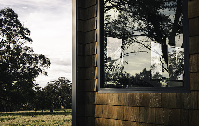
A reoccurring weakness in my images (one which I will improve upon) is the lack of people. I use to think having people in images distracts from the subject. However, it is not always the case. Looking back at my images, many of them could greatly benefit from having a human element in the foreground or background. Such is the case below, if I had a person walking along the path on the left-hand side, it would immediately give a sense of scale and build on the story of the image.
A reoccurring weakness in my images (one which I will improve upon) is the lack of people. I use to think having people in images distracts from the subject. However, it is not always the case. Looking back at my images, many of them could greatly benefit from having a human element in the foreground or background. Such is the case below, if I had a person walking along the path on the left-hand side, it would immediately give a sense of scale and build on the story of the image.
Strengths:
- Rule of thirds composition
- The use of leading lines
- Black and white post processing heightens the sense of drama
- Retained distortion, in this case it helps to lead the eyes into the image and again heightens the sens of drama
Weaknesses:
- Blown out highlight in sky
- A figure in the foreground would provide a sense of scale
- A tighter crop
 |
| Taken with Canon 70D, EF-S-10-18mm-f-4.5-5.6-IS-STM |
Compositionally, as a newbie I'm also prone to bad cropping. I'm not talking about cropping in post-processing but poor composition in camera and as a result you end up with parts of the foreground or background elements cropped off; awkwardly.
Take the image below of Tokyo Station, the taxi at the front is cut off awkwardly that only part of the side mirror is in the frame. Also the top of the building in the background is also cut off. These make the image look incomplete, and that the cropping wasn't intentional but a mistake.
Solution?
If I only took a few steps back! It is just that simple, I would have solved both problems. The result would be a better-composed image.
There you go, I've just demonstrated how I analyse my images by identifying its strengths and weaknesses. It has highlighted areas that I definitely need to improve on and taught me to be a little patient when I compose a shot.
Take the image below of Tokyo Station, the taxi at the front is cut off awkwardly that only part of the side mirror is in the frame. Also the top of the building in the background is also cut off. These make the image look incomplete, and that the cropping wasn't intentional but a mistake.
Solution?
If I only took a few steps back! It is just that simple, I would have solved both problems. The result would be a better-composed image.
 |
| Taken with Canon 70D, EF-S-10-18mm-f-4.5-5.6-IS-STM |
Hope this will help you also, and if you have any tips that you'd like to share, let me know!
Keep shooting!
Like it, Share it!
Don't miss out on future posts, sign up to the mailing list!
Don't miss out on future posts, sign up to the mailing list!
___
Come and say hello!

0 comments